Introduction
A few years back, I had the pleasure of watching an incredible talk by Mark Dalgleish, which shone a light on a glaring issue in the realm of web and mobile development: our design systems are falling short of their full potential.
This debate essentially splits into two camps:
- Code in design tools: This camp champions tools that enable designers to piece together UI elements using a drag-and-drop interface, subsequently generating code that developers can directly incorporate into their projects.
- Design in code: Here, the focus is on embedding design principles directly into code, aiming to meticulously arrange pixels on the screen to reflect a well-thought-out design system.
Mark delved into how adopting code as a design medium fosters a common language between developers and designers, and how establishing the right abstractions can turbocharge your UI development process. He encapsulated this idea perfectly when he said:
Your job as a design system developer is to accurately model the way designers think.
This article aims to adapt some of his insights for the mobile domain, particularly within the React Native ecosystem. More than that, I'm excited to share a methodology I've been leveraging across my projects, one that has significantly enhanced my productivity in UI design.
Ready to dive in? Buckle up!
Styling in React Native
First off, let's quickly revisit how React Native lets devs jazz up their apps.
In React Native, the bread and butter components like View and Text come with a style prop. This takes either a
plain JavaScript object or an array packed with styles. The style names and values closely mirror web CSS, but with a twist:
they use camelCase (borderRadius instead of border-radius).
The React Native documentation suggests getting familiar with the StyleSheet API. It's an abstraction akin to CSS StyleSheets,
pushing devs to shift away from inline styling towards consolidating all styles into a single object placed outside the component's definition.
However, pulling styles out of the render function, though it cleans up your code, kinda messes with the component's readability.
One of the coolest aspects of JSX is how it lets you visually digest the render flow of a component from top to bottom. But, when you park your StyleSheets at the file's end, it disrupts this flow, making you bounce between the render bits and the styles applied to specific elements.
Ah, the joys of context switching.
The Power of Constraints
Just like with CSS, when you're styling in React Native, you're spoilt for choice. Take vertical alignment in CSS as an example – you've got no less than 15 ways to achieve the same result. Yep, you heard that right.
Now, this might sound like a flex (and it kind of is), but having a buffet of options isn't always a good thing. Too many choices can lead to decision paralysis or choice overload. You find yourself spending more time than you'd like to admit just deciding on an approach, which is hardly the best use of your time.
And without a shared playbook in your team, everyone ends up doing their own thing. This not only makes your code look like a patchwork quilt of styles but also turns maintaining it into a nightmare. This is exactly why having a design system is more than a luxury - it's a necessity.
Embracing Design Systems
Think of a design system as the secret sauce behind consistent and harmonious user experiences across various products or platforms. It's a collection of interconnected guidelines, principles, and assets all singing the same tune.
While many companies prefer to tailor their own design systems to broadcast their unique brand identity, not everyone has the luxury of an in-house design squad. In such cases, leaning on established design frameworks crafted by design pioneers makes a whole lot of sense. It's like choosing a well-loved recipe to ensure your dish turns out delicious.
Noteworthy mentions include the Apple Human Interface Guidelines,
Google Material Design, and Ant Design by Alibaba.
For those diving into React Native, you're in luck, because there are open-source libraries like react-native-paper
and ant-design-mobile-rn that bring these design systems to life in your apps.
The magic of design systems lies in their ability to add a structured layer to the UI-building process, a common playbook for everyone to follow. This dramatically cuts down on the mental gymnastics involved in design decisions.
At their core, these systems revolve around the concept of design tokens, which are essentially the building blocks of your design theme. This theme specifies everything from typography and spacing to colors, borders, and shadows, bringing a coherent look and feel to your digital products.
The Challenge with View: Too Much Freedom?
Design systems are fantastic for establishing a cohesive set of rules for your apps to grow beautifully. However, one crucial aspect often flies under the radar — layout management.
React Native provides the View component, the cornerstone for layout construction.
View serves as a flexible container for any type of child components, governed by the style prop for layout adjustments.
But with over 30 props and 50 style properties, it's a breeze to end up with code like the following:
import React from "react";
import { View, Text } from "react-native";
const ViewExample = () => {
return (
<View style={styles.container}>
<View style={{ backgroundColor: "blue", flex: 0.3, marginRight: 16 }} />
<View style={{ backgroundColor: "red", flex: 0.5 }} />
<Text style={{ marginLeft: 10 }}>Hello World!</Text>
</View>
);
};
const styles = StyleSheet.create({
container: {
flexDirection: "row",
height: 100,
padding: 20,
},
});Unfortunately, this is more common than not, highlighting several issues:
- Mixing inline styles with
StyleSheetdefined styles - Use of arbitrary values ("magic numbers")
- Margins, the devil of layout
- Disruption of the top-to-bottom flow
- Lack of separation of concerns, with
Textalso taking on layout duties - Layout settings buried within the
styleprop
The core issue with the default View component is its low-level nature.
Let's dive into how you can design a component on top of View that provides the right level of abstraction to smooth out these wrinkles.
Restyle
Restyle is an open-source library from Shopify that brings type-enforced styling into the React Native space with TypeScript. It's a beacon for those looking to weave a fully typed theme into their design system. Yet, it doesn't quite nail the art of imposing the right constraints on the elemental UI components.
Key functions of Restyle, like createBox and createText, churn out View and Text counterparts stripped of the style prop.
Instead, styles are articulated through top-level props.
import { createBox } from "@shopify/restyle";
const Box = createBox();
const RestyleExample = () => {
return <Box padding="m" marginRight="s" />;
};While Restyle addresses issues like maintaining collocation and eliminating the style prop, it overlooks some critical challenges.
For example, it doesn't provide a clear separation of concerns between layout and content components. createText injects
spacing props like margin and padding into the Text component, which isn't ideal.
Also, you are faced with the dilemma of too many API choices,
and no clear guidelines on when to use which.
Rethinking Layout
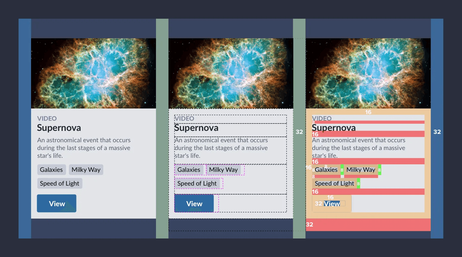
Diving into UI design with a focus on white space can transform your approach and sharpen your eye for layout intricacies.
Space isn't just a filler; it's a critical component of design. In React Native, you manipulate space with style properties like padding, margin, and absolute positioning (think left, right, top, bottom). But the sheer complexity and lack of clear guidelines can make mastering space a formidable challenge.
So, how do you demystify spacing to streamline the creation of mobile layouts? The secret lies in establishing clear-cut rules.
- Components should be free of surrounding white space.
- Layout components take ownership of white space.
- Margins are forbidden, with the exception of negative ones.
By adopting these straightforward principles, you ensure that layout responsibilities are solely in the hands of layout components, and that you design with a mindset that mirrors that of your designers.
Say goodbye to slapping a marginRight or a paddingTop on a text component. Fonts and typography should stick exclusively to their font-type properties.
Unveiling the Stack Component Magic
The Stack component is a culmination of all these efforts to master layout. This clever abstraction ditches the traditional concept of margins,
streamlining the way you define whitespace into two simple properties: padding and spacing.
What’s more, it elevates essential Flexbox properties to top-level props, opting for concise names that maintain clarity of purpose. This design choice not only simplifies the API but also aligns closely with our design principles, ensuring a more intuitive development process.
// Stack.tsx
import * as React from "react";
import { PropsWithChildren } from "react";
import {
FlexStyle,
StyleProp,
View,
ViewProps,
ViewStyle,
DimensionValue,
} from "react-native";
import { mapPaddingToStyleObject } from "./utils";
export enum Size {
None = 0,
XS = 4,
S = 8,
M = 16,
L = 24,
XL = 32,
}
type GridValue = Size | 0;
export interface StackProps extends ViewProps {
flex?: number;
direction?: FlexStyle["flexDirection"];
padding?:
| GridValue
| [GridValue]
| [GridValue, GridValue]
| [GridValue, GridValue, GridValue, GridValue];
spacing?: GridValue;
justify?: FlexStyle["justifyContent"];
align?: FlexStyle["alignItems"];
wrap?: FlexStyle["flexWrap"];
borderRadius?: number;
background?: string;
grow?: number;
shrink?: number;
basis?: number;
width?: number | DimensionValue;
height?: number | DimensionValue;
children?: React.ReactNode;
}
const Stack: React.FC<StackProps> = ({
flex,
direction = "column",
borderRadius,
background,
align = "stretch",
justify = "flex-start",
padding,
spacing,
wrap = "nowrap",
grow,
shrink,
basis,
width,
height,
style,
children,
...rest
}: PropsWithChildren<StackProps>) => {
// It translates the web CSS API (Number, [Number, Number] or [Number, Number, Number, Number]) to RN paddings
const paddingStyle = mapPaddingToStyleObject(padding);
const stackStyles: StyleProp<ViewStyle> = {
flexDirection: direction as FlexStyle["flexDirection"],
flexWrap: wrap,
justifyContent: justify,
alignItems: align,
flexGrow: grow,
flexShrink: shrink,
flexBasis: basis,
width,
height,
borderRadius,
flex,
backgroundColor: background,
...paddingStyle,
};
const childStyle: StyleProp<ViewStyle> = {};
if (direction === "column" && spacing) {
childStyle.marginTop = spacing;
} else if (direction === "row" && spacing) {
childStyle.marginLeft = spacing;
}
return (
<View {...rest} style={[stackStyles, style]}>
{React.Children.toArray(children)
.filter((c) => c)
.map((child: any, index) =>
React.cloneElement(child, {
style: [child.props.style, index > 0 && childStyle],
})
)}
</View>
);
};
export default Stack;However, there's catch. This implementation hits a stumbling block when the Stack component includes composite child components.
These composite components don't pass the style prop down to their top-level view wrapper, leading to spacing issues.
// App.tsx
import Stack, { Size } from "./Stack";
// Spacing is ignored
const CompositeComponent = () => {
return <Stack width={100} height={100} backgroundColor="red" />;
};
export default function App() {
return (
<Stack flex={1} padding={Size.M} spacing={Size.L}>
<Stack width={100} height={100} backgroundColor="green" />
<CompositeComponent />
</Stack>
);
}To sidestep this limitation, there's a bit of manual intervention required.
You'll need to explicitly define a style prop within your composite component and apply it to the top-level view wrapper in its render output.
// App.tsx
import Stack, { Size } from "./Stack";
const CompositeComponent = ({ style }) => {
return <Stack style={style} width={100} height={100} backgroundColor="red" />;
};
export default function App() {
return (
<Stack flex={1} padding={Size.M} spacing={Size.L}>
<Stack width={100} height={100} backgroundColor="green" />
<CompositeComponent />
</Stack>
);
}Even though React Native itself recommends adding a style prop to all composite components as best practice,
this manual step is vulnerable to being forgotten. Ideally, you want the Stack component to embody true magic,
effortlessly managing this aspect on your behalf.
Originally, the magic behind Stack relied on applying varying margins to its children based on their sequence, assuming these children are either simple,
natively stylable components like Text or View, or composite ones that forward the style prop to their outermost element.
But as of React Native version 0.71, this isn't a problem anymore.
Bridging the Gap with RN 0.71
React Native version 0.71 marks a pivotal enhancement by integrating three fresh style properties into the Flexbox toolkit: rowGap, columnGap, and gap.
rowGapsets the size of the gap (gutter) between an element's rows.columnGapsets the size of the gap (gutter) between an element's columns.gapsets the size of the gap (gutter) between rows and columns. It is a shorthand for rowGap and columnGap
This update eradicates the need for individually manipulating child margins to achieve consistent spacing. Spacing becomes a native feature of the Yoga layout engine, ensuring seamless application across both simple and composite components, no matter how many layers deep the closest native element is. 🎉
// Stack.tsx
import * as React from "react";
import { PropsWithChildren } from "react";
import {
DimensionValue,
FlexStyle,
StyleProp,
View,
ViewProps,
ViewStyle,
} from "react-native";
import { mapPaddingToStyleObject } from "./utils";
export enum Size {
None = 0,
XS = 4,
S = 8,
M = 16,
L = 24,
XL = 32,
}
type GridValue = Size | 0;
export interface StackProps extends ViewProps {
flex?: number;
direction?: FlexStyle["flexDirection"];
padding?:
| GridValue
| [GridValue]
| [GridValue, GridValue]
| [GridValue, GridValue, GridValue, GridValue];
spacing?: GridValue;
justify?: FlexStyle["justifyContent"];
align?: FlexStyle["alignItems"];
wrap?: FlexStyle["flexWrap"];
borderRadius?: number;
background?: string;
grow?: number;
shrink?: number;
basis?: number;
width?: number | DimensionValue;
height?: number | DimensionValue;
children?: React.ReactNode;
}
const Stack: React.FC<StackProps> = ({
flex,
direction = "column",
borderRadius,
background,
align = "stretch",
justify = "flex-start",
padding = 0,
spacing,
wrap = "nowrap",
grow,
shrink,
basis,
width,
height,
style,
children,
...rest
}: PropsWithChildren<StackProps>) => {
const paddingStyle = mapPaddingToStyleObject(padding);
const stackStyles: StyleProp<ViewStyle> = {
flexDirection: direction as FlexStyle["flexDirection"],
flexWrap: wrap,
justifyContent: justify,
alignItems: align,
flexGrow: grow,
flexShrink: shrink,
flexBasis: basis,
width,
height,
borderRadius,
flex,
backgroundColor: background,
...paddingStyle,
};
if (direction === "column" && spacing) {
stackStyles.rowGap = spacing;
} else if (direction === "row" && spacing) {
stackStyles.gap = spacing;
stackStyles.flexWrap = "wrap";
}
return (
<View {...rest} style={[stackStyles, style]}>
{children}
</View>
);
};
export default Stack;Row and AbsoluteStack
Building on this solid foundation, you now have the opportunity to craft a suite of utility components that extend Stack,
tailored with preconfigured props for frequently encountered scenarios. This could include components designed for horizontally
aligning elements or positioning them absolutely within a layout.
// Row.tsx
import * as React from "react";
import Stack, { StackProps } from "./Stack";
const Row: React.FC<StackProps> = (props) => {
return <Stack direction="row" {...props} />;
};
export default Row;// AbsoluteStack.tsx
import * as React from "react";
import { StyleProp, ViewStyle } from "react-native";
import Stack, { StackProps } from "./Stack";
interface PositionProps {
top: number;
right: number;
bottom: number;
left: number;
}
const AbsoluteStack: React.FC<StackProps & Partial<PositionProps>> = (
props
) => {
const positionStyles: StyleProp<ViewStyle> = {
position: "absolute",
top: props.top,
bottom: props.bottom,
left: props.left,
right: props.right,
};
return <Stack {...props} style={[positionStyles, props.style]} />;
};
export default AbsoluteStack;React Native Layout Primitives Library
You are more than welcome to copy and paste the code snippets above into your project, but if you want to save time and effort, I've published a library that encapsulates these layout primitives into a single package. It's called react-native-layout-primitives.
Conclusion
Space in design systems deserves to stand in the spotlight. Without a clear set of rules, your style code can easily descend into chaos and inconsistency. Pinning down those rules might seem daunting, but thankfully, visionaries like Nathan Curtis and Mark Dalgleish have paved the way. They've shown us how to approach layout with the precision of a designer, narrowing the gap between design and development, and making margins a thing of the past.
This article aims to illuminate the path towards embracing well-crafted layout components for building user interfaces in React Native effortlessly, with a fresh perspective that highlights how thinking in terms of whitespace can transform your approach to UI design.
Adapting might feel a tad overwhelming initially, but with time, it'll all fall into place, akin to experiencing a Matrix-level revelation.
And the best part? The more you use Stack and Row components, the more intuitive building UIs becomes.
You'll find yourself visualizing the layout structure in your mind's eye, no screen peeking necessary.
Happy coding! 🚀